In the design world, we all have our "old reliables." Fonts like Montserrat and Poppins became industry staples because they were accessible, clean, and consistent.
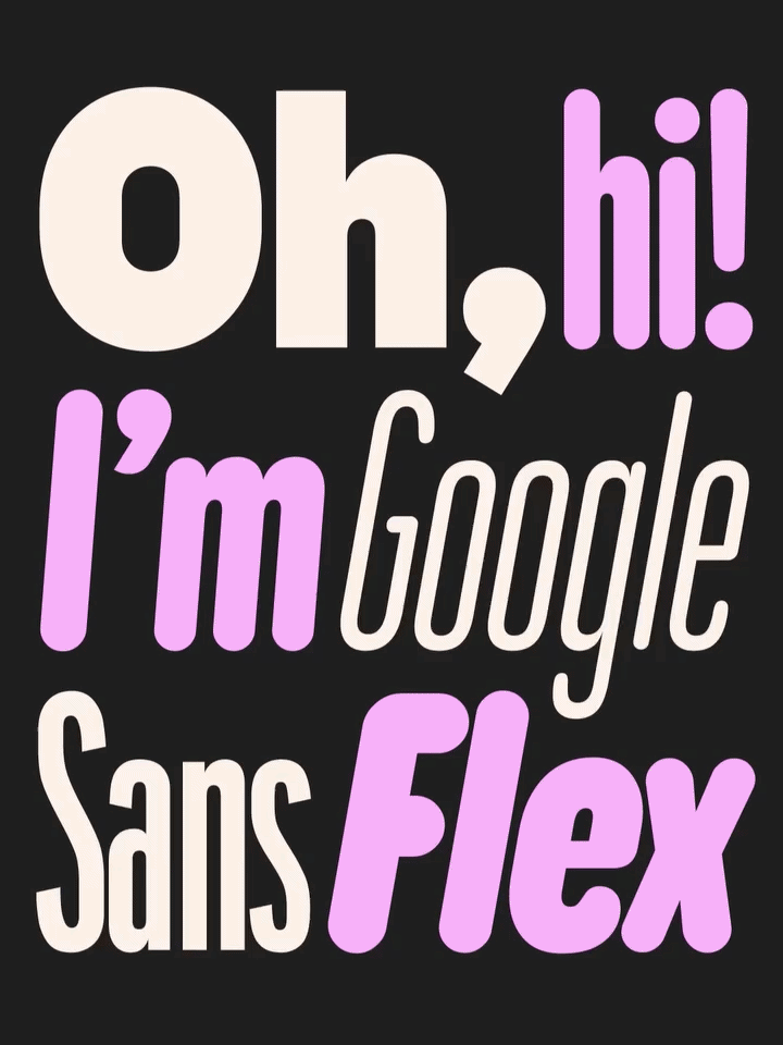
But in late 2025, the landscape shifted. Google officially released Google Sans Flex as an open-source typeface. That's a significant milestone for designers: one of the most sophisticated type systems in the world is now a tool available to everyone.
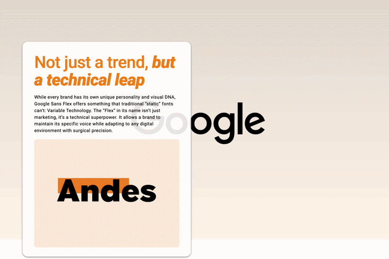
Not just a trend — a technical leap
While every brand has its own personality and unique visual DNA, Google Sans Flex offers something traditional "static" fonts can't: Variable Technology. The "Flex" in the name isn't just marketing — it's a technical superpower. It lets a brand keep its distinct voice while adapting to any digital environment with surgical precision.
Why the "Flex" matters for your digital presence
At Andes Dev, we bridge the gap between Digital Marketing and High-End Development. Here's why this release is a game changer for both:
- Precision in marketing and social media: Because it's a variable font, we're not limited to fixed weights like "Bold" or "Regular." We have granular control over the width and thickness of every character. That means we can fine-tune headlines for an Instagram ad or a mobile landing page to make sure they hit with maximum impact, every time.
- Superior performance for developers: Traditionally, loading multiple font weights slowed your site down. With Google Sans Flex, we load a single file that handles everything. The result: faster load times, better SEO, and a snappier user experience.
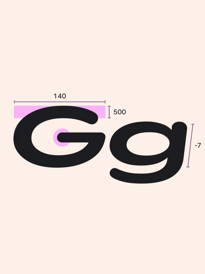
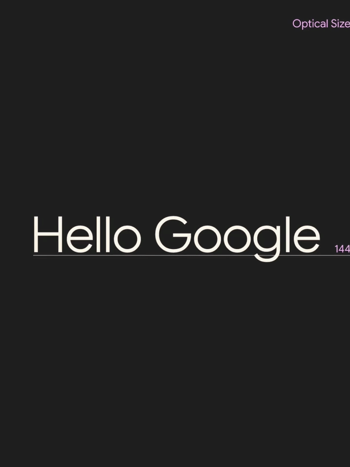
- Smart legibility (optical sizing): The font actually adapts its shape based on screen size. It stays crisp and readable on a smartwatch while remaining bold and expressive on a massive billboard.
The new "reliable"
Google Sans Flex isn't trying to be every brand; it's trying to be the most capable version of a sans-serif for the modern era. Whether you're building a complex dashboard or a viral marketing campaign, having a typeface that "grows with you" is no longer a luxury — it's a competitive advantage.
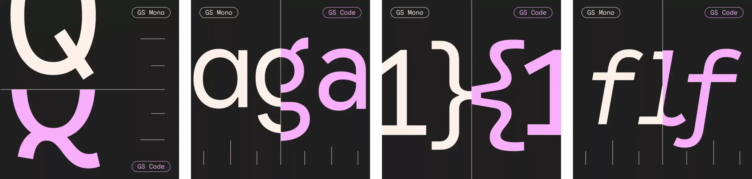
Google Sans Flex preserves legibility even in the most challenging conditions, keeping your UI sharp and accessible. On top of that, you get granular control over weight, width, optical size, and more. Google's research shows an 80% user preference when its expressive power gets to shine!